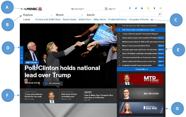
The Home page of MSNBC has changed many times over the years, but this time they have gone for a more typography clear website. Letters are added to each section for clarity, and will be discussed below.
- The Logo: Is clear and readable, there can be no mistake which site you have visited.
- Explore, Watch, Join In, and Search Box functions are emphasized, and these are four function of the site they want you to pay attention to.
- Latest trending news are seen clearly and readable even from a distance.
- The banner type news display has clear pictures, and allows huge emphasized headlines to not clash with the background. It comes with a blue play button on the Image if a video is there.
- The accordion menu is directly tied to the banner menu, and the writings are clear and concise as well. You can either use the banner or the accordion menu, for both are linked as you scroll. It also has a blue button with the word Watch and a play icon, so one can easily note that a video is available for the story.
- Additional news is presented, no major distraction images, with clear text.
- Programs offered by MSNBC can be found with a simple background, picture of host, and the name of the program clear and concise.
The theme continues all the way down as you scroll, and hence we will not go further, but we will look at what happens when you click a story.

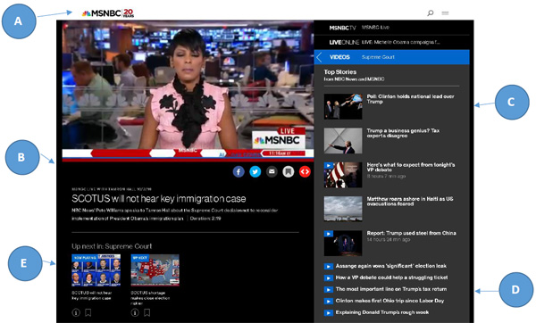
Once again we will use letters to define why the typography is good or bad on the site. The site uses a lot of space to allow the text to shine through. Viewing the site on a tablet or phone is just as clear and refreshing to read.
- The logo once again shines through
- The Video is supported by the emphasized title and a clear write up summary.
- Other videos/ Top Stories are clear but only the latest five or shown, but the thumbnail are neatly stacked to the left, so that the text can be clearly read.
- The videos that are not so recent are easily read and stacked neatly.
- Up Next Options follow a similar trend, thumbnail and clear crisp text.
We find the site to be aesthetically pleasing, mobile friendly, and the typography is well presented across all devices.
Variations in the typography:
H2 tags enclose the anchor tags to present the main titles of stories with videos. No additional colors used, but the size difference is evident. Stories without videos use a grey summary area, and the text is black and clean. The read more on stories without videos follow the theme of the site and are blue. li tags enclose anchor tags and use a white font color clear and concise. Fonts used are NeueHaasGrotesk which is a web font, and "Helvetica Neue",Helvetica,Arial,sans-serif which are more popular to the average PC. The site uses some CSS font smoothing techniques, and also font scaling techniques. The typography automatically sizes as you adjust the window size, and all the variation rules stay true to the site. All in all, the site is well designed for all screen sizes and devices.
How to add typography fonts, color, and size to HTML
So based on the following observations you may want to know how to add fonts to your website. There are three simple ways to do this, and other complex ways using scripting.
Firstly You must have content on your website enclosed between tags, for example: < h1 > Header < /h1 > < p > Regular paragraph < /p >.
Second you apply the font, color, size by using inline styles, header placed styles, or CSS included styles. See example below.
- Inline styles: < p style="color: red; font-family: courier; font-size: 160%;" >Text to be styled< /p >
- Header Included style enclosed in style tags go inside the header tag: < header >< style > p { color: red; font-family: courier; font-size: 160%; } < /style >< /header >
- A Header include of a CSS file: < link rel="stylesheet" href="styles.css" > This code will simply pull the CSS file into the HTML and add the typography styles
An included CSS would look like this
body { background-color: powderblue; }
h1 { color: blue; font-family: courier; font-size: 300%; }
p { color: red; font-family: courier; font-size: 160%; }
