
Synopsis
The concept of contrast in visual design is about using contrasting colors, sizes, images, and the arrangement of elements to draw in the viewer's focus and interest on specific key areas of a web page.
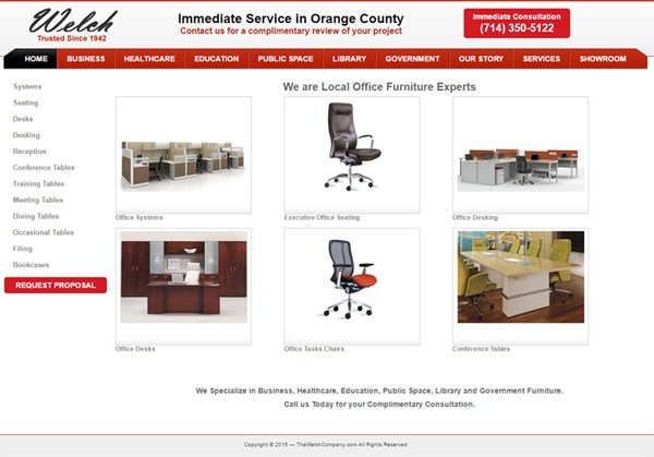
I found that the website, theWelchCompany.com, does an excellent job using contrasting elements to make their site fun and easy to use. Here are some specific examples:
- Contrasting element colors create visual flow: This site uses 6 primary colors (black, white, light gray, dark gray, brick red, and bright red) and has 5 content regions (header, navigation, menu, main content, and footer.) The use of color contrast between text and the background helps create a visual flow from the top header region (black text on a light gray background - contrast ratio of 19.4), to the tab options (contrast ratio of 6), and finally to the main content region (contrast ratio of 3.3.) This flow helps visitors see in order: 1) the name of the company and what they do, 2) what key page features are available, and 3) the main content.
- Contrasting Font Style: Only two font types are used on this website: a san-serif font and a cursive font. Normally these font families would not work well together, but the cursive style is applied to the company name logo and this helps draw attention to it and the company name. However, the black font color of the logo helps tie it together with other black header text thus letting the visitor know that it belongs here.
- Contrasting Bugs: The call to action bugs are colored in bright red and placed on a white or light gray background. This color arrangement not only offers a high contrast ratio at 5.3, but the bright red does not fit within the tone range for the other colors on the site. Thus, these call to action bugs tend to stand out even more. However, it is important to note that the contrast ratio is not as high as other elements on the website, so these bugs do stand out, but not so much as to detract the visitor's ability from seeing other page elements first.
- Navigation Region: The navigation bar consists of a row of tab buttons that have white text on a brick red background. The active tab is highlighted with a black background to help visitors know what section of the website they are at. Using white text on a black background offers the highest possible contrast ratio at 21.
- Images: Product images are placed in the center of the page on a white background (contrast ratio from 3.3 to 4.4.) These product images function in a similar fashion as the left side text menu navigation options. By placing the images in a bounded gray frame, the images tend to stand out more as something I can click on.