
Synopsis
Wayfair.com is a great example of the alignment principle of design. It uses alignment to help guide the shopper's eye and to highlight important design and feed the customer's search for inspiration. It keeps its important information front and center while uses intuitive design and alignment for featured products and sales.
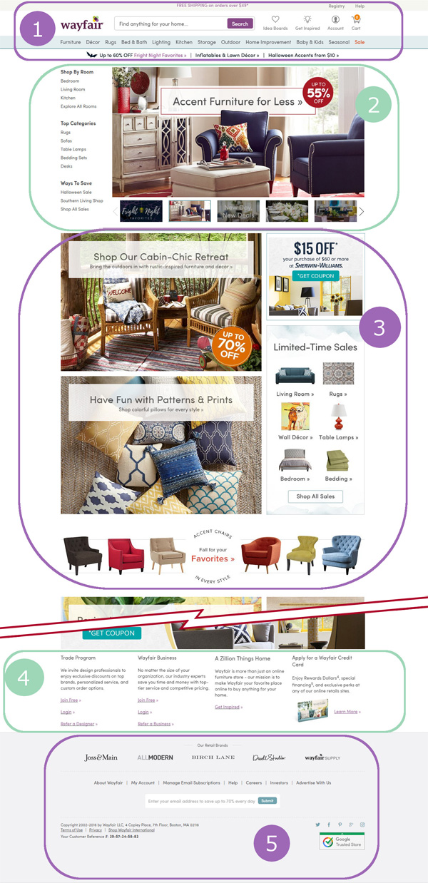
- Wayfair.com by keeps important links and its search bar front and center in the header. Doing this makes it easy for a shopper to quickly find useful links.
- Down the page, Wayfair.com has set up a column of popular pages and items to quick link visitors to the left so it is easily caught by the visitor's eye and featured articles in a slideshow aligned to the right.
- Further down are more highlighted items and sales. They are organized into broken columns with large pictures to the right and two smaller pictures to the left with a long center picture on the bottom. This demonstrates a good use of alignment in a grid system to make information easy to locate and follow.
- Wayfair.com features links and information that may not be as pertinent to the regular shopper. This information with links is kept in a small font size and split into four columns to make reading and locating the subject's associated links easy.
- In the footer, Wayfair.com features brands, less common but nessecary links, and a chance to sign up with email. Lastly, grouped together to the left is the contact, copyright and terms aligned to the left for easy location with social links off the right to keep things seperated.