Synopsis
REPETITION means "repeating visual elements such as line, color, shape, texture, value or image which tends to unify the total effect of a work of art as well as create rhythm." It can also be defined as patterns, which give an aesthetically pleasing look to websites.
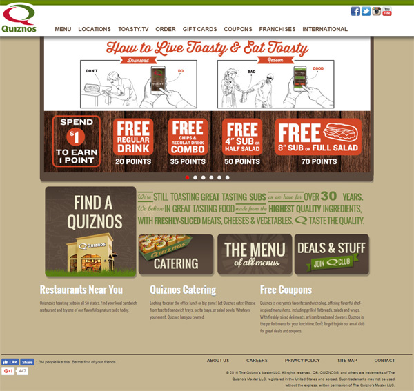
Quiznos displays a great example of repetition throughout their homepage. We can see repetition used in the color, shapes, typography, and images. The color used in the title "How to Live Toasty & Eat Toasty" is also used in the squares below, that offer coupons that will fulfill your need to live and eat "toasty." Repeating this color naturally leads the eye from the title to the coupon. Also the repetitive use of light colors on the top, down to darker colors below, naturally leads the eye down the page.
The repetition of rectangles and squares has been used well on this website. They give a smooth down flow effect throughout the page. The top, white, thin, rectangle banner leads down to the thicker white rectangle. The two cartoon rectangles break up the single surrounding rectangle, which leads down to the smaller squares below. These smaller squares are inside a large dark rectangle, which leads the eye to the dark, smaller rectangle, even though it is only on the left side of that larger, dark, rectangle. This rectangle on the left leads the eye to the even smaller rectangles, which flow back to the right, lining the eye back up with the large set of rectangles above. Nicely done, Quiznos.
When we visit a website, we naturally want to see repetition. Our brains function more smoothly when our eyes have a pattern to follow. The repetitive typography, Free Free Free, draws our eye right to the purpose of the page. A website can guide a viewer's eye right to where they want them to look, simply by using repetition in an effective, visually pleasing way.
